Abstract
The abundance of new visual tools for FRAME Entries and
SAS/AF in the windowing environment creates a challenge
for building applications with an effective graphical
user interface (GUI). This paper will explain how style
and consistency in design enable applications to be more
effective for the user. It will explore the different
elements of a GUI, such as windows, icons, menus,
controls, messages and dialog boxes; and explain how they
can be used effectively. It will expand on techniques of
style, including object placement and proper wording of
text messages. This introductory set of guidelines will
help developers create applications which are easier for
end-users to learn and therefore more effective.
Note: This paper focuses on methods of creating effective
Graphical User Interfaces through the use of FRAME Entry
and other AF tools. It is not, however, intended as a
tutorial on the techniques of FRAME Entry.
Introduction
The effectiveness of an application is fully realized
when the user understands its functionality and enjoys
using it. This is accomplished when the design process is
developed with the user at heart. In order to meet the
user’s needs, the application needs to be easy to
learn and interactively intuitive. Good interface design
fulfills these requirements by applying the following
principles:
· Consistency
· Clarity
· Interactive Communication
The first hurdle for the user is learning how to use the
application. One of the key principles in Graphical User
Interface (GUI) design is aimed at making this learning
process as painless as possible. Its goal is to create
visual and functional consistency within the application,
across applications and with objects from the "real
world". "Software products with consistent
application interfaces help orient users... making
learning and using the software easier" (SAS 10).
This consistent orientation creates a sense of comfort
and predictability since the user may have seen that
particular behavior in another application or similar
objects modeled from the real world.
The SAS software development environment facilitates this
effort through the use of object oriented programming.
This programming technique helps to maintain Graphical
User Interface consistency from existing standards. For
example, "With the FRAME entry development
environment, you can create a set of customized classes
from the supplied classes, with the standard appearance
you prefer" (SAS 10). This set of standards allows
new objects created, such as a dialog box, to obtain
characteristics, attributes and methods from its parent
class. This is accomplished through a procedure known as
inheritance. The capability of creating new customized
objects modeled after the base "widget" class
provides consistency because GUI designers can create
FRAME entries that inherit existing standard
characteristics.
Along with consistency, the application interface should
also be visually, conceptually and linguistically clear.
One key element in achieving clarity is through effective
interactive communication. Feedback to the user is a good
example of this communication. "Feedback can inform
the user that a particular mode has been entered,
acknowledge a command, point out an error, track the
progress of an operation, and so on. Visual (either
graphical or textual) feedback is the most common, but
auditory feedback is also useful" (Microsoft 37). If
feedback is not done properly, it can be distracting. The
application should facilitate the user’s task but it
should not call attention to itself. By adhering to the
correct visual standards, the GUI will put the user in
control of the application, not vice versa. These design
concepts will be demonstrated in this paper by further
exploring elements that make up the Graphical User
Interface.
GUI Elements
The main component of a graphical user interface is the
window. The two types of windows discussed in this paper
are the following:
· Application Window
· Dialog Box
Application Window
The central framework, which contains the main functions
of the application, resides in the application window.
This is the window which will appear when the application
is started. Some important elements which form the
application window are the following:
· Title Bar
· Menus
· Message Bar
Title Bar
The title bar uniquely identifies the application window
by labeling it with a name. The title should contain the
application’s full name with every first character
capitalized. If the application operates on a file, the
name of the file is hyphenated to the application name.
The file name should be all in caps including the file
extensions as shown in Figure 1. 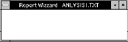
Figure 1
Menus
Menus are important means of communicating information
between the user and the application. Depending on the
information required, there are three different types of
menus used:
· Pull-down
· Pop-up
· Cascade
Pull-down Menus
Pull-down menus are the most commonly used menus out of
these three types. Each menu has a name which is
displayed on the menu bar of the application window. The
title of each menu should be a single word which best
describes all the items within that menu. Avoid using
multiple words in the name since multiple words in a menu
can be mistaken for multiple pull-down menus. For the
sake of uniformity, the menu title should have the first
character capitalized. No special characters or numbers
are to be used in menu titles.
Keyboard access is essential for advanced users so each
menu should have a mnemonic assigned. "If possible,
use the first character of the menu item as the mnemonic.
If that’s not possible, try the next consonant in
the menu title. If you still can’t get a mnemonic
that doesn’t conflict, use the first available
vowel" (Minasi 100). For example, the File menu item
would have ‘F’ as the mnemonic as shown in
Figure 2.
It is recommended that "every application should
include a set of standard menus: File, Edit and Help...
" (Microsoft 87). File and Edit are standard menus
that should always appear as the first two menus.
Application specific menus are placed in between this and
the Help menu. The Help menu is always placed as the last
menu on the tile bar. The advantage of using standard
menus is that it give users a familiar starting point
each time a new application is learned.
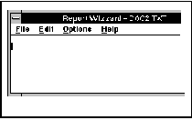
Figure 2
Once a pull-down menu is
selected, a group of menu items are displayed as a
selection list. Menu items should be grouped in logical
sets of a few items. Separators can be used to
distinguish these groups. Keep the groups small since
"people tend to remember information in chunks of
three of four items" (Microsoft 101). Menu item
names do not have to be a single word but try to keep it
under three words if possible. Item names need to be
unique within each menu but may repeat within another
menu. Mnemonic assignments should be applied similarly to
menu as in titles, but for certain ordered lists, numbers
may be used as shown in Figure 3. Capitalization of first
character is also done here except for connectors such as
"the, or, and, etc...". If the menu item opens
up a dialog box, then the item name is followed by an
ellipsis(...). This indicates to the user that more
information will be required before executing the
requested command.
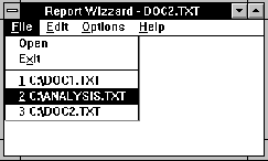
Figure 3
Pop-Up
Pop-up menus or "floating" menus appear by
clicking the mouse on objects inside the application
window or dialog box, as shown in Figure 4. The menu
items will contain commands which reflect where the mouse
is clicked. The menu item conventions are similar to that
of pull-down menus except for some minor differences.
Pop-up menu items should only contain commands which are
most frequently used. They are therefore shorter and
should not repeat items from the pull-down menus. The
purpose of pop-up menus is to provide an efficient way of
accessing certain commands within the context of the
mouse location.
Figure 4
Cascading
Cascading menus, or sometimes called hierarchical menus,
are sub-menus of the pull-down menus. It is usually
placed to the right side of the pull-down menus. It is
activated by a right pointed triangle next to the menu
item name. The only time a cascading menu is recommended
is when it simplifies a pull-down menu that has too many
menu items. It has disadvantages however since this
causes difficulty when trying to get to a certain command
which has been buried deep under sub-menus. In general,
avoid using cascading menus unless absolutely necessary.
General Guideline for Menu and Menu Items
To optimize usability of menus and menu items,
applications should gray out commands which are not
applicable in that particular instance, as shown in
Figure 5. This disabling affect is much more effective
than removing the menu or menu item since users remember
where objects are through visual association. If graying
out an item causes ambiguity and confusion, a message
should be displayed on the message bar explaining why the
item is grayed.
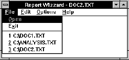
Figure 5
Message Bar
A efficient way of communicating short messages to the
user is through the message bar. The message bar in FRAME
or PROGRAM entries are located at the top of the
application window, as shown in Figure 6. This gives the
application the ability to request information from the
user or to inform the user about the status of a process.
The message bar should only request information that is
not immediately required. Since the message bar does not
always capture the user’s attention, use a message
dialog box instead for important requests. The message
bar is an excellent place to explain menus or other
objects which may be difficult to decipher from their
names. In general, the message bar should be used for
short informative messages instead of critical or timely
messages.
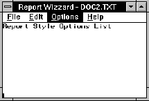
Figure 6
Dialog Box
Dialog boxes are windows which prompt the user for more
information through the use of controls, text entries or
other objects. Placement and proper usage of objects
within dialog boxes are crucial for accomplishing visual
and linguistic clarity. Some of the objects in a dialog
box include:
· Command Buttons
· Radio Boxes
· Check boxes
· List Boxes
· Label & Container Box
Command Buttons
One of the most common yet sometimes misused controls are
buttons. Every dialog box should have at least one button
that closes the dialog box. Before buttons were available
on PROGRAM entries, keys were used to execute an END or a
CANCEL command. This approach suffices, but for users who
are not familiar with the proper key commands, buttons
accompanying these key commands are visually more
concise. If the dialog box only needs an acknowledgment
from the user, only one button is needed, labeled OK.
Another type of dialog box may require two buttons. The
desired command for this dialog box is for one button to
close the dialog box and initiate an action, while the
other button closes the dialog box without initiating any
action. Those buttons are labeled OK and Cancel
respectively as shown in Figure 7. An optional help
button is also recommended for dialog boxes which contain
a lot of information. Besides these standard buttons,
application specific buttons can be placed between the
OK, Cancel and the Help buttons. The Help button should
therefore always be placed as the last button. Similar to
standard menus, standardizing buttons gives a starting
point for users to grasp a basic understanding of the
dialog box at first glance.
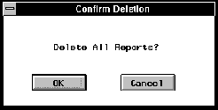
Figure 7
Another method of
instilling predictability is through the practice of
proper button placement. "The most appropriate
places for buttons in dialogs boxes are at the right or
at the bottom" (Microsoft 133). If more than two
buttons are used, grouping them adds visual legibility.
The OK and Cancel should always be grouped together
separated from other action buttons. If OK is not used,
the Cancel is then grouped with other action buttons.
Space the buttons evenly within each group and add
slightly more spaces in between groups. The buttons
themselves should be the same size with their name
centered inside. This rule should only be broken if there
is an exceptionally long command name for a particular
button. In that case, have all the buttons the same size
and give extra length to the exceptional button. For
quicker keyboard access, there should always be a
defaulted active button assigned so if the user were to
press RETURN, it would execute the default button’s
command. This button is usually the OK button unless
executing the OK causes damage. If buttons were placed
properly, the default button would usually be the left or
top most button, as shown in Figure 8.
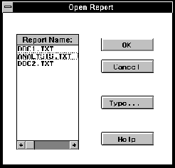
Figure 8
Radio Boxes
Radio boxes, also known as Radio buttons, display
different possible values of items (usually text) as
choices for users to select. The one characteristic that
makes radio boxes unique from other selection mechanisms
is that "the items in a radio box are mutually
exclusive, so users can select only one" (SAS 66).
Radio boxes are most effective if used for small sets of
selections, usually two to five items, as shown in Figure
9. If there are more than five choices, a selection list
should be used instead. The advantage of using a radio
box is that all the choices are displayed more
accessibly. Whenever the selection choices are static,
try to divide the items into small commonly related
groups and place them into radio boxes.
Check boxes
Check boxes supply choices for the user, but they differ
from radio boxes in that the user can select more than
one check box at a time. This type of selection control
is commonly used to set attributes for a certain object
since more than one attribute may apply at one time.
"Check boxes can be grouped, but grouping does not
prevent the user from turning the checkboxes on and off
in any combination" (Microsoft 106). If a group of
checkboxes need all to be set on or off frequently, it is
recommended to add another selection choice to promptly
set all items on or off at once. Besides this optional
exception, checkboxes are usually mutually independent.
List Boxes
List boxes function more similarly to radio boxes than
checkboxes since only one selection is allowed at a time.
The main difference, however, is that they display the
selection choices in a list boxes which may be scrolled.
This scrolling list structure allows for more than the
recommended five items within the selection list. It also
permits the selection choices to be more dynamic since
"if a particular choice is not available in the
current context, it should generally be omitted from the
list" (Microsoft 108). Even though the items in the
list may change, the size of the list box should be the
same. The height should allow for "three to eight
choices" (Microsoft 109) and the width should just
be slightly wider than the widest item in the list.
Label and Container Box
Text label and container boxes are both important for
identifying and grouping controls in a dialog box, as
shown in Figure 9. Although certain controls contain the
options for a title (i.e. list box), it is more
consistent to create text labels and leave the title
options blank. Whenever controls are related, group and
label them with a container box. Capitalize the foremost
word and all other words for the title "except for
articles (for example, a, an, and the) coordinate
conjunctions (for example, and, or nor, and for),
preposition (for example, by through and with)" MS
120. Try to keep the label short and concise to the
meaning of the controls, with no more than three words.
Place the text label near the top upper left corner.
Following these guidelines will help users locate the
controls quicker. This makes it much easier for users to
learn to interact with these dialogue boxes.
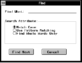
Figure 9
Conclusion
Effective GUI design is accomplished through consistent
and clear presentation of the graphical elements in an
interactive application. Following standards in defining
windows, dialogs, menus, and graphical control elements
helps users learn how to use the application quickly. The
application design also needs to be conceptually simple
and clear. This involves designing menus and graphical
elements with visual and textual clarity. The potential
of applications can therefore be fully realized after
applying these design techniques.
References
Microsoft Corporation (1992), The Windows Interface: An
Application Design Guide, Redmond, WA: Microsoft
Corporation.
Minasi, Mark (1994), Secrets of Effective GUI Design,
Alameda, CA: SYBEX Inc.
SAS Institute Inc. (1993), SAS/AF Software: FRAME Entry
Usage and Reference, Version 6, First Edition, Cary, NC:
SAS Institute Inc.
SAS is a registered trademark or trademark of SAS
Institute Inc. in the USA and other countries. ®
indicates USA registration.
|